How will Google's mobile-friendly update affect your site?
Digital Marketing
In an effort to make it easier for users to find relevant, high quality search engine results that are optimized for their device, Google recently announced a change in their mobile search algorithm that will include ‘mobile-friendliness’ as a ranking signal. This change means that if your website isn’t optimized to be viewed on a mobile device, it may negatively affect where your website ranks in Google search results.
This change, to be implemented April 21st, 2015, has the subject of mobile user experience in the spotlight. If you haven’t started to wonder about your website's mobile-friendliness, it’s time you do. According to Google, the change will affect mobile searches worldwide, in all languages, and will have a “significant impact on search results”.
In this post, we’ll explore:
- What does it mean to be mobile-friendly?
- Why is being mobile-friendly so important?
- Is your site already mobile-friendly?
- Different types of mobile-friendly websites that function within Google’s newest parameters.
- How to make the necessary changes to make your website mobile friendly (and make sure your customers can still find you online!)
What is "Mobile-Friendly"?
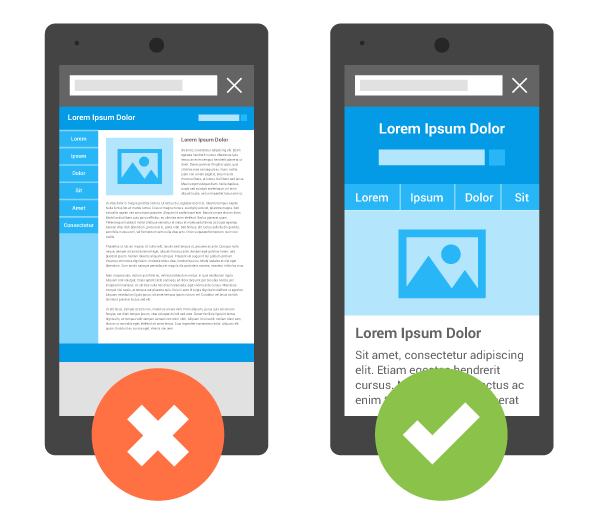
To be mobile-friendly is to be optimized for the mobile experience. Mobile-friendly websites are adjusted specifically for mobile devices as opposed to non mobile-friendly sites that just display the desktop version of a website on a mobile device. Just because a website can be seen and navigated on a mobile device doesn’t mean it’s mobile-friendly.
A website is mobile-friendly when:
- Mobile content functions properly & content sizes specifically for a mobile device.
- It is easily legible on a small screen, and does not need pinching and/or zooming.
- It is integrated to the needs of someone using a phone rather than a desktop computer. For example, tap to call is enabled for mobile devices, making it easy to phone a business from their website.
Why you need a mobile-friendly website:
Over 50% of searches are now done on a mobile device. Given the significant shift from desktop search and ad spend to mobile in recent years, the most impactful shift of the internet since the mid 90s, it’s about time to optimize your website for mobile users. Google has simply given a timeline in which you now have to go mobile, by rewarding those who go mobile-friendly, and penalizing those who don't.
It’s all about the experience According to a recent Google report, if a user is frustrated with the experience of your mobile website, there’s a 61% chance they will leave immediately and go to another website. Whereas if a user has a positive experience with your mobile website, they are 67% more likely to buy a product or use a service.
Over 50% of traffic to ecommerce sites are coming from a mobile device The mobile trend for online shopping has seen steady growth over the last five years, and now there’s no disputing it: mobile commerce is now the default way that people shop online with over half of all ecommerce traffic coming from a mobile device. The rise in this mobile traffic is fuelled by social discovery of brands as a major marketing channel.
Millennials prefer to search and buy on mobile. Millenials are set to outspend baby boomers by 2017, and if your business wants to grow into the future, you'll need to begin tailoring your online experience to this growing demographic who like to search and purchase online.
How do I know if my site is mobile-friendly?
- Put your site to Google's mobile-friendly test.
- If you have a Google Webmaster Tools account, you'll receive an email from Google warning you your site isn't mobile-friendly. If you don't have a Webmaster Tools account, click here to get started.
Three kinds of mobile-friendly websites
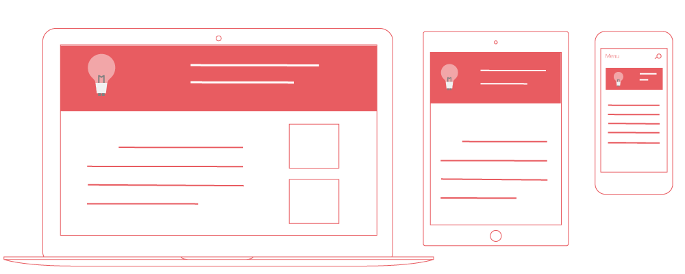
1. Responsive design* (Metric’s choice for mobile-friendly sites)

Responsive design means that a website is coded to be responsive to any size screen and will adapt content to fit the screen whether is it large, small, horizontal, or vertical.
What we love about responsive design:
- Responsive means site owners have only one site to manage, which keeps SEO simple (as opposed to working on a desktop site and a mobile site independently)
- Many quick, simple options to transition to responsive design
- Depending on what type of content management system your website is built on, there are many easy to install responsive templates to choose from
- Google recommends it because it provides the best experience for its users
How to make your existing website responsive:
For people using a popular content management system (CMS) like wordpress, blogger, drupal etc., the easiest way to make your site responsive is investing in a responsive theme or template. Our favourite place to purchase responsive templates is themeforest.
If you have a custom CMS, speak to your web development provider, or ask us!
2. Dynamic serving
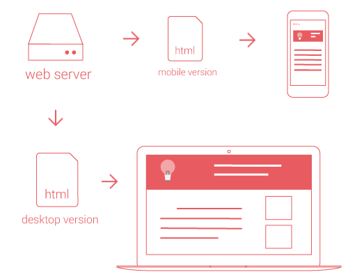
With a dynamic serving website, when someone visits your site they are served different content depending on the device they are using. ie if they visit your site using a smartphone, they are served the small version of that page and when they are using a desktop they are served the large version of the page.
Dynamic serving requires extra cost and work, as you are creating two different versions of your site. This may be worth it if you absolutely need specific features or have content that is very different for a mobile user vs a desktop user.
3. Mobile URLs
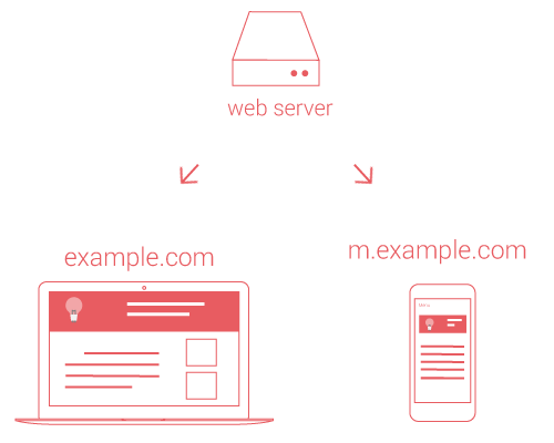
Mobile urls are web pages designed for specific types of mobile users. Mobile urls, like dynamic serving, have very specific cases in which they are the best option. Mobile urls are often used for device specific pages like "iphone page" or "ipad page".
Steps to becoming mobile-friendly
We recommend taking the following steps to ensure that your site is ready for Google's upcoming changes:
- Put your website through Google’s mobile-friendly test tool
- Peruse Google’s guide to mobile friendly websites
- Use Google Webmaster Tools to generate a mobile usability report
- If available, purchase a responsive web theme for your current site
Questions? Contact us, we're happy to help.


Copyright © Metric Marketing Inc. 2024. All Rights Reserved.